Title Research: Watch the Titles Website
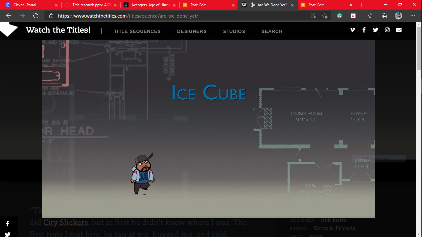
Similar to my experience on Art of the Titles, my experience with Watch the Titles was a fun one. When opening the website my first instinct was to compare it to the website I had viewed five minutes prior. Because of that I instantly noticed a sleeker interface, which showed less information but in a cleaner way. The last website deemed cluttered compared to this one and I was very appreciative of it because it opened my eyes to a common title mistake, clutteredness. From this, I understand that when creating my titles, it is imperative that I give them the proper amount of spacing from each other and also my background. It should be a clean-cut contrast between the titles and my background. The titles should no feel like their overshadowing the background. It should feel like the titles are sharing and complementing the background. If possible move with it in the sense that they should flow at the same speed. Meaning that the pacing of my scene should either be proportional(1:1) or inversely proportional(1:-1) with the titles.


Comments
Post a Comment